For the past few years, people have been spending more time on their phones than on their desktop computers. And now, mobile web traffic accounts for over half of all global internet traffic.

If you dip into your WordPress website analytics, you might see a similar story among your visitors. So, how should you as a WordPress admin accommodate these mobile users?
A WordPress mobile plugin is the best solution. From boosting performance to reformatting your site for phone screens, the add-ons that come with these plugins can help deliver an optimal experience for all your visitors.
First, we'll give you three features to look for in a mobile-friendly WordPress plugin. Then, we'll share our favorite mobile-friendly WordPress plugins.

How to Make a WordPress Site Mobile-Friendly
For a website to be mobile-friendly, it must be:
- Responsive, meaning that the page layout adjusts to the dimensions of the mobile screen for easier reading.
- Optimized for speed since mobile devices tend to have fewer computational resources than desktop computers and thus take longer to load web pages.
- Navigable, since mobile screens lack the space for bulky menus and navigational elements.
Each of the plugins we recommend below incorporates these mobile-friendly features, so find one that catches your eye and try it out.
Plugins for Making Your Site Mobile-Friendly
- Superfly
- Jetpack
- Smush
- AMP for WP
- AMP
- WP Mobile Menu
- Max Mega Menu
- Hummingbird
- Touchy
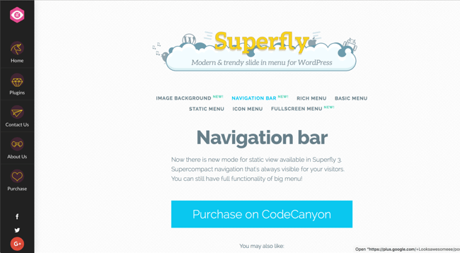
1. Superfly
Superfly is a mobile-responsive wordpress plugin that makes your navigation menu responsive, too. Choose from vertical push, sliding, static navigation, icon toolbar, or fullscreen menus to create a user experience your visitors will love.
Companies that manage several websites will find Superfly to be a quick and nimble solution to their need for a mobile-friendly site because of the export/import functionality that allows you to move between all the sites seamlessly
What we like about Superfly:
- The live editor lets you see what you're changing in real-time.
- Submenu navigation for larger sites that need a little more organization.
- A full-screen menu option that adds a professional look to your site.
2. Jetpack
As a WordPress user, there’s a good chance you’ve already heard of the Jetpack plugin. Made by the team behind the WordPress CMS, Jetpack consists of various modules to enhance your site’s marketing, security, SEO, analytics, and a lot more. It’s an all-in-one solution that cuts down the total number of plugins you’ll need to install (which itself benefits mobile performance).
What we like about JetPack:
Jetpack is a great mobile-friendly WordPress plugin option because of its performance optimization features including:
- A content delivery network that serves files more quickly.
- Lazy loading images that won't slow your page down.
- Infinite scroll that enhances the user experience.
- WordPress-optimized video hosting to make video content a breeze for you to upload and engaging for visitors to watch.
So, if you’re considering making Jetpack a part of your WordPress site, the plugin’s mobile benefits might just push you to click “install.”
3. Smush
One of the biggest enemies of page performance — and, by extension, mobile page performance — is large image files. The larger the image file, the longer it will take to load on the page, slowing your entire site down.
What we like about Smush:
Smush is a WordPress image optimization plugin that tackles the page performance issue head-on.
- Automatically compresses images when you upload them without a visible drop in quality.
- Lazy-load images to give the impression of a faster website.
- Retroactively compress all the images you've uploaded to your site.
Starting at $6 per month, you can upgrade to Smush Pro, which compresses files to a greater extent than the free version, removes file size limits (the free version only compresses images under 1 MB), uses a content delivery network to send images, and automatically backs up your original image uploads. You can also pay for a membership ($19 per month) which grants access to all WPMU DEV premium plugins, including Hummingbird (which we’ll discuss later on).
4. AMP for WP
AMP is an HTML framework introduced by Google. Originally intended to optimize web pages for mobile devices, it now applies to web pages delivered across all devices. It reformats your website’s pages into a mobile site to serve more efficiently on smartphones and tablets. This helps to improve the browsing experience while boosting rankings in Google, search since your website complies with its AMP standards.
What we like about AMP for WP:
AMP for WP provides a lot of flexibility and utility for free.
- Install extensions that make the plugin compatible with other popular plugins like WP Forms, WooCommerce, Elementor, Divi, and Contact Form 7.
- Subscribe to a membership to get several of these extensions in bulk. For more details, see AMP for WP’s pricing page.
5. AMP
The AMP plugin is another free way to apply Google’s AMP practices to your web pages. Made by the Google AMP project contributors, this plugin lets WordPress admins publish mobile-optimized web pages without any programming on their part.
The AMP plugin converts your site's code into an AMP-friendly mockup by removing incompatible elements for you. It identifies these problems and fixes them, complete with explanations as to why certain website features impede performance. It also identifies AMP-incompatible WordPress plugins that may hurt your site.
What we like about AMP:
This plugin also provides some flexibility in terms of your AMP configuration.
- Opt to use only one AMP-first theme if you want your entire site to follow AMP guidelines.
- Serve both AMP and non-AMP pages — for instance, you can serve the former to mobile visitors and the latter to desktop visitors.
6. WP Mobile Menu
Smaller mobile screens present navigational challenges for web designers — how do users know where they can go and how to get there, without the space for sidebars and header menus?
WP Mobile Menu is one popular fix.
What we like about WP Mobile Menu:
This freemium plugin adds these great features to your WordPress site to make it mobile-friendly:
- Add a responsive, three-layer mobile menu to any WordPress website.
- Choose from standard text-only menus, or place images, logos, icons, and branding elements onto your menus.
- Hide menus while they load and conveniently slide them into view when they do.
WP Mobile Menu offers premium versions of the tool that can scale this solution as your business grows. There’s Professional ($6.49 per month) which lets you remove menus from specific pages and adds some additional menu options, as well as Business ($9.99 per month), which enables WooCommerce compatibility, and Enterprise ($29.99 per month)
7. Max Mega Menu
Max Mega Menu is another popular plugin for mobile menus, best for websites with extensive pages and navigation. These websites require especially large menus, or mega menus, which are challenging to implement on mobile websites. Max Mega Menu converts your existing WordPress menus into mega menus and pays particular attention to responsive design.
What we like about Max Mega Menu:
Max Mega Menu lets you make quite a few unique changes to your site, including:
- Set breakpoints for the menu to collapse on smaller screens.
- Use a mobile-optimized menu option that can hide your sub-menus and save screen space.
- Have your menu slide in from the side, or appear as a standard drop-down.
The base version of the Max Mega Menu plugin is free. However, there’s also a Pro version (starting at $29 for one site) that supports more features like sticky, tabbed, and accordion menus, plus custom icons and lightweight integration.
8. Hummingbird
Hummingbird is a caching plugin for WordPress — it instructs your visitors’ browsers to save copies of your website files locally, so they’re faster to load in the future. Caching eliminates the need to fetch certain files from your web server every time a visitor returns to your site, which makes a big difference for mobile users.
What we like about Hummingbird:
Hummingbird includes several features that make this the optimal choice for WordPress admins who want a lightning-fast and responsive site:
- Enable GZIP compression for faster file delivery.
- Minify and defer CSS and JavaScript code.
- Eliminates render-blocking resources
- Turn on lazy loading for images.
Hummingbird is also a helpful guide for new users — it gives tips and suggestions for optimizing your mobile site so you can understand how the plugin is making a difference.
The above optimizations are free, but you can also subscribe to Hummingbird Pro for $6 per month and get a content delivery network, enhanced file compression, automated scans, and uptime monitoring. Hummingbird Pro is also included in a WPMU DEV membership.
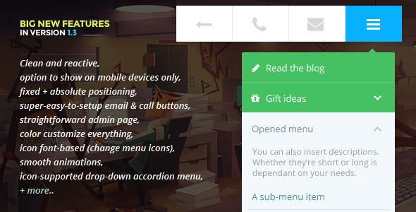
9. Touchy
If you're looking for a user-friendly, mobile-friendly plugin for your WordPress site, check out Touchy. This lightweight, customizable plugin will give your site the responsiveness you're looking for while blending seamlessly with your UI design.
What we like about Touchy:
- It includes both fixed and absolute positioning.
- Includes an icon-supported drop-down accordion menu for a sophisticated look.
- Supports smooth animations for creative sites with visual-heavy pages.
Go mobile with WordPress plugins.
While it would be nice for all users to browse on similar devices, that will probably never be the case. With the growing popularity of smartphones and tablets, creating a mobile user experience will always be a priority for WordPress site owners, developers, and designers.
Fortunately, WordPress plugins work behind the scenes to make websites mobile-friendly. Don’t turn away half your audience at the door — instead, install a free or a premium plugin to make your websites sleeker, faster, and easier to navigate.
Editor's Note: This post was originally published in January 2020 and has been updated for comprehensiveness.