Finding the right WordPress theme isn’t easy — for many beginners, it can be outright daunting. Your theme shapes not just how your site looks, but how your visitors view your online presence as a whole.
There’s a lot more to consider on top of just looking and working properly. Your theme impacts your user experience, security, and search engine rankings. It also needs to be easily customizable and user friendly on the back end, so you’re not pulling your hair out every time you need to move a widget. And, with thousands of free and premium options, there’s the chance of some serious theme FOMO.
Here’s one tip to make your search a bit easier: If a theme doesn’t work or look good on mobile screens, toss it aside. Chances are, around half of your web traffic comes from mobile devices. If your website doesn’t cater to this massive user base, saying you’re missing out would be an understatement.
Do your mobile users a favor by picking a mobile-friendly theme for your site. By doing so, you’ll ensure that your site looks just as stunning on a mobile phone as it does on a desktop. In this post, I’ll share 18 WordPress themes that work exceptionally well on mobile devices.
But first, what should you look for in such a theme?
 What Makes a Theme Mobile-Friendly?
Mobile-friendly WordPress themes work as well on mobile devices as they do on desktop browsers. There are two factors important to better mobile functionality.
First, mobile-friendly themes are responsive. This means that the layout and appearance of the page adjusts to best suit the width of the screen. Many modern websites serve as great examples of responsive design. Visit one of your favorites, shrink the browser window, and see what happens.
In WordPress, simply displaying the same site layout on any screen size won’t cut it. A quality theme should automatically adjust the sizes and placement of your page elements for smartphones and tablets.
Second, mobile-friendly themes are lightweight. Whenever someone loads a page of your WordPress site, your web server needs to build the page and deliver the contents to the visitor’s browser. The less extra code and excess features included in your theme, the less work your server has to do to send the page, and the faster your site will load.
Lightweight WordPress websites are especially important for mobile viewing, as mobile devices lack the computing power of desktop devices. This can cause content-heavy pages to lag on mobile — prevent this problem with a speed-optimized theme.
Almost any premium WordPress theme (as well as many free ones) will claim to have one or both of these features. Even then, not all themes are created equally for mobile. So, without further ado, let’s cover some of the best options out there today.
Best Mobile-Friendly WordPress Themes
- Soledad
- Avada
- Porto
- Uncode
- Sydney
- Betheme
- Woodmart
- Qi Theme
- uDesign
- Astra
- Ultra
- Divi
- Enfold
- JustBlue
- Hestia
- Sitka
- Saasland
- WooShop
- Profile Theme
- H-Code
Pro tip: Power up your site with forms, pop-ups, and live chat by adding the HubSpot WordPress plugin, then check out these HubSpot-compatible WordPress themes.
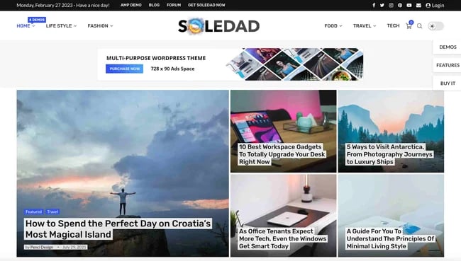
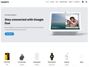
1. Soledad
Soledad is a top-selling theme for blog and magazine websites, with over 43k sales and a nearly 5-star rating. The multipurpose WordPress theme is comprehensive and flexible and comes with an astonishing 6000+ homepage demos and 200+ pre-built websites.
What makes this theme mobile-friendly is its 100% responsive design which automatically adjusts the size of images, ads, and other page elements to fit beautifully on smartphones and tablets. In addition, the theme is optimized for loading speed and fully supported AMP (Accelerated Mobile Pages) to ensure the best experience for your mobile website visitors.
2. Avada
Avada is one of the best WordPress themes out there, period. Hundreds of thousands of beginners, professionals, agencies, businesses, marketers, and creatives use Avada for their desktop and mobile websites. Avada is mobile-friendly and 100% responsive across all devices, with regular updates to ensure your website remains visually optimized and high-performing at all times.
If you’re in the market for basic or advanced customization options without the need to code, try Avada. Its drag-and-drop visual content editor makes designing, maintenance, and updates simple. And, with the Global Styling feature, you can quickly preview your designs on a range of screen sizes.
To see this theme in action, check out our favorite websites using the Avada theme.

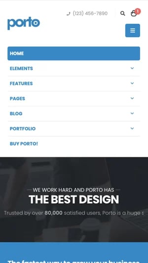
3. Porto
Porto is a multipurpose and ecommerce WordPress theme, trusted by more than 73,000 customers. This is a theme that’s packed with features — such as a page builder, a header builder, a footer builder, and a product page builder.
If you’re wanting to build a beautiful and customized website, Porto makes it easy to make the site work on all device types, including mobile.
4. Uncode
Uncode is another visually appealing theme that is highly responsive to mobile devices. Jam-packed with powerful features, this theme comes with more than 40 pre-built layouts, each of which can be imported with a single click. The developers have programmed the theme to be lightweight, so your pages will load promptly on slower devices.
Uncode is compatible with several modern WordPress plugins: WooCommerce, Slider Revolution, and Custom Lightboxes to name a few. The theme also has a content block section that lets you create beautiful headers, footers, and replicate sections of content.

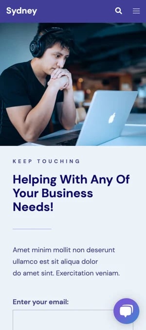
5. Sydney
If you’re looking for a theme that’s elegant, but also performs well on mobile devices, take a look at Sydney. This theme is a responsive business theme that’s recommended by the team at Elementor and has been downloaded over 100K times on WordPress.org.
With Sydney, you can choose from three well-designed Starter templates. Plus, if you use Sydney Pro, you get even more templates, with 15 designs such as Agency, Cafe, and SaaS to choose from.
Also included in the theme are features that make it ideal for users looking for mobile-friendly design. These include a customizable scroll-to-top button that makes it easy to navigate to the top of any page, Google AMP support, and responsive typefaces.
6. Betheme
Betheme is a premium WordPress theme with a modern design, powerful features, and an extensive, user-friendly interface. Betheme comes with compatibility with major drag-and-drop page builders such as Elementor, making it easy to create unique, visually stunning websites.
Betheme is fully responsive so that you can adapt your page perfectly to all devices (laptops, smartphones, and tablets). You can also create different versions of your website specifically designed for each device type, which is perfect if you want to show something special on a particular screen. Whether you’re a web developer or a business owner, Betheme is the perfect place for you to start building your first site without any coding experience required

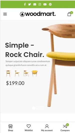
7. Woodmart
Woodmart is a modern and stylish WordPress theme that is perfect for any type of website. The theme comes with 3 header layouts for mobile devices, advanced mobile side navigation options, and a simple mobile interface. Advanced mobile side navigation allows you to place links such as a cart, checkout, search box, or account on the left side of your page so that visitors can quickly access tools while browsing.
Woodmart also includes custom widgets, a convenient mega menu, unlimited colors, and many more great features. The theme has a fully responsive design, to ensure that your store looks great on every device.
8. Qi Theme
Qi Theme is a fast, light, multipurpose WordPress theme built to fit any purpose or niche. Some of the things that set it apart from other themes are the premium design, the number of demos it ships with, and the customization options it offers.
With Qi Theme, you can manually choose how your website behaves for each responsive state. If you have a portfolio, for example, the theme will let you choose column options based on the screen resolution of the device where the website is viewed. You’ll have the same options for your blog and even typography.
The theme was purpose-built to have small file sizes and fast page speed. Between its performance and the customization options, it’s a great theme to look into when mobile-friendliness is important.

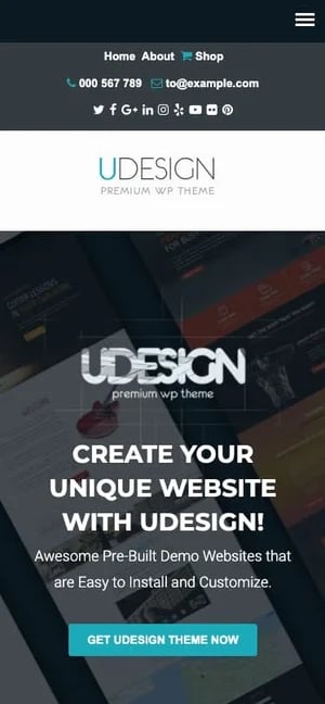
9. uDesign
uDesign is another popular and responsive WordPress theme ideal for ecommerce sites. Even if you have little or no knowledge of coding, uDesign can help you build a professional site for your business.
To make your site mobile-friendly, choose any of uDesign’s responsive page layouts — your site will conform to tablet, smartphone, and desktops screens. This responsiveness is coupled with two mobile menu options and SEO optimization to ensure your site will rank higher in organic search results.
10. Astra
Astra is one of the best free WordPress themes available today, and over one million active users would agree. The Astra theme comes loaded with dozens of features and mobile-ready starter templates — importing one will help you launch a responsive site in minimal time for minimal cost.
Astra provides several ways to adapt your WordPress site to mobile. You can adjust your typography size based on the device, add breakpoints (widths that trigger changes in the site’s layout), and modify the header for mobile devices. When paired with this theme’s acclaimed loading speeds, lightweight build, and compatibility with top page builders, you’re on your way to making sure your site works on any screen.
11. Ultra
Ultra is a WordPress theme that's flexible and can be used for both personal and business websites. It includes a variety of preset layouts and includes features like section scrolling for easy navigation and readability. Ultra also includes smart layouts, which give you complete control over a web page from header to footer. Not to mention that everything is mobile-friendly, so you can customize away without worrying about how things might look on mobile vs. desktop.
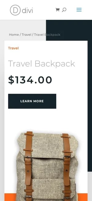
12. Divi
Divi is both a multipurpose WordPress theme and a responsive WordPress page builder in one. You can use the Divi Builder to easily customize your module placement, fonts, and colors, then toggle between different screen widths inside the builder and see how your designs adapt.
Divi also comes with hundreds of website packs, which are premade, mobile-friendly layouts for an entire website that you can populate with your content. After installing a pack, there’s much less need to worry about mobile optimization yourself.
Read more in our full Divi review and check out some examples of websites built with Divi.
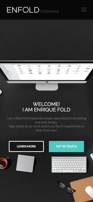
13. Enfold
One of the most popular themes from the ThemeForest marketplace, Enfold helps to majorly decrease friction when creating your desktop and mobile websites. Enfold places emphasis on its ease-of-use in the build process, thanks to its native builder, in-depth documentation, and narrated tutorials to assist users. Enfold also comes with dozens of responsive pre-built website templates you can apply quickly to your site, as well as mobile-optimized and responsive slider displays.
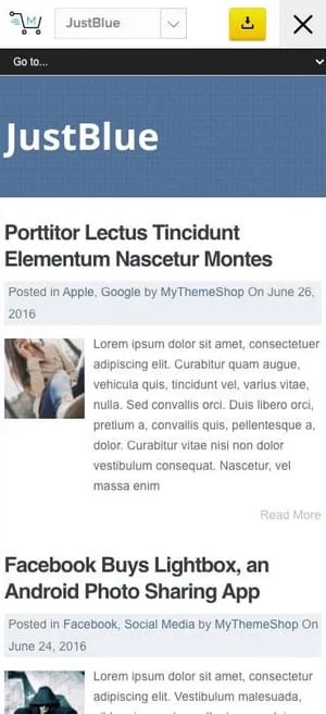
14. JustBlue
The JustBlue theme is another quality free option for WordPress bloggers. It’s responsive, speed and SEO-optimized, and allows for comprehensive control over your site’s look and feel — all customization can be controlled from your theme options panel. Also of note is the related posts widget, which exposes visitors to more of your content and helps build out your readership.
15. Hestia
Hestia is a simple but contemporary one-page WordPress theme. Its sleek and minimal approach makes it a great choice for modern online businesses and startups that want to prioritize navigational ease. And, of course, all of its one-page layouts are responsive to mobile screens. With these layouts, you can quickly create and launch your site — there’s no need to start from scratch.
Hestia compatible with major page builders and the WooCommerce plugin, and templates also include pre-built sections for your contact info, bio, client testimonials, shop, and more.

16. Sitka
Sitka is a new and worthy addition to the blogging theme space — it emphasizes its broad range of customization options, layouts, one-click demo imports, mobile-friendly font options, and featured area designs which can be configured with ease. Beginner and advanced bloggers will get a lot of value from this option.
All Sitka layouts are responsive, and the theme is frequently updated to address any issues with mobile compatibility.

17. Saasland
Saasland is a multipurpose theme that's ideal for pretty much any type of website. It's completely responsive and all of the demos included (over 50 prebuilt ones) will look great on any device or screen that you load them on. Simply use the "One Click Demo Import" plugin that's comes installed with the theme and you'll have your site up and running in no time.
Saasland also includes 10 portfolio layouts, WooCommerce store features, and over 400 pre-designed elements that you can add to your site. Adding them is easy with the drag-and-drop builder as well as the user-friendly design interface.
.webp?width=702&height=357&name=02_Preview%20(1).webp)
18. WooShop
We’ve covered some WooCommerce-compatible themes up to this point, but the WooShop theme specializes in online stores powered by WooCommerce. The theme allows for extensive customization of your homepage and product pages, and any change you make can be adapted to mobile screens.
WooShop also includes a library of retina font icons to help users navigate while saving space on smaller screens, plus all mobile-friendly Google fonts are included as well.

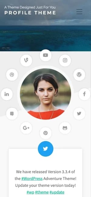
19. Profile Theme
If you need a theme for your online portfolio, resume, professional profile, or any other personal site, try Profile Theme, a premium mobile-friendly option from Organic Themes.
Profile Theme offers all the key features you’d expect from any theme, all geared toward presenting your best virtual self. It’s responsive, retina-optimized, and customizable with a handful of theme templates, a slideshow feature, and social media integrations.
20. H-Code
For a more feature-rich theme option for your mobile site, try H-Code. This theme is loaded with customization options to build a stunning site for desktop and mobile. And, with over 50 responsive homepage templates and 20 responsive one-page demos, you’ll likely find a pre-built design you like out-of-the-box.
.webp?width=300&height=604&name=14%20Best%20Mobile-Friendly%20WordPress%20Themes%20for%202020-2%20(1).webp)
Making It Work on Mobile
Today, it’s crucial that your WordPress site is responsive and mobile-ready. The right mobile-friendly theme will save you hours of work trying to fit each page to multiple screen dimensions. Consider any of these themes to ensure visitors have a consistently positive experience, no matter how they prefer to browse.